

Custom ADA Sign Material Manufacturer: Your Guide to Quality and Compliance
2026-07-06
Navigating the world of ADA-compliant signage can feel overwhelming, especially when quality and material choice directly impact both accessibility and brand image. Whether you’re updating a facility or starting fresh, partnering with a manufacturer that truly understands the nuances of tactile standards and durable materials is non-negotiable. LYSHIRE has built its reputation on precisely that—merging meticulous compliance with custom craftsmanship so your signs don’t just meet requirements, they elevate the entire space. In this guide, we’ll walk through what sets premium ADA sign materials apart, how to spot true manufacturing expertise, and why getting the details right from the start saves time, money, and headaches.
Material Choices That Make or Break ADA Sign Durability
ADA signs face daily exposure to handling, cleaning agents, and environmental stressors, so material selection directly determines how long they remain compliant and legible. Photo-engraved acrylic, though popular for its clarity, tends to scratch easily under frequent touch, eroding both braille legibility and visual appeal. In contrast, materials like Rowmark's Ultra-Matte finish offer a non-glare surface that resists fingerprints and minor abrasions, preserving readability long after installation.
For outdoor or high-humidity settings, the wrong substrate can warp, delaminate, or trap moisture behind tactile elements. Phenolic resin is a rugged alternative that handles temperature swings without swelling, while brushed aluminum combines corrosion resistance with a professional look that holds up in lobbies. Even edge quality matters—roughly cut plastics can snag clothing or cleaning cloths, leading to premature edge lifting. The trick is matching the material's core properties to the specific demands of the environment: a restroom sign needs waterproof substrates, while a hallway sign might prioritize impact resistance over moisture tolerance.
Beyond surface durability, color stability keeps signs compliant. UV-stable inks and subsurface-printed layers in photopolymer signs prevent fading in sunlit corridors, avoiding the gradual loss of contrast required by law. Some polymers naturally yellow over time, particularly if they lack UV inhibitors, turning clean white backgrounds into an aged amber that fails color contrast standards. Even cleaning chemicals can attack certain plastics, so selecting chemically resistant materials ensures routine maintenance won't slowly degrade tactile dots or letterforms. In the end, investing in robust materials like stainless steel or UV-treated acrylic might cost more upfront but eliminates frequent replacements that disrupt accessibility and budget cycles.
Demystifying ADA Signage Rules Without the Jargon
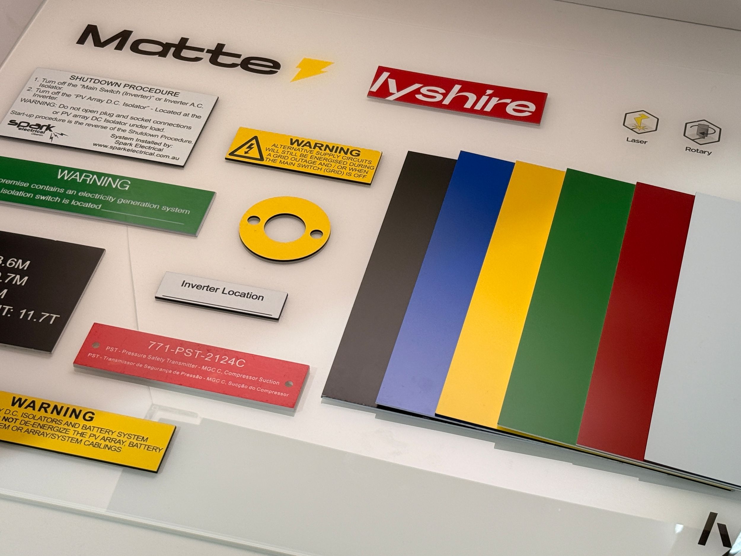
ADA signage rules can feel like a tangled web of government language, but they boil down to making spaces accessible for everyone. The core idea is simple: people with vision, hearing, or mobility challenges should be able to navigate a building independently. Signs play a huge role in that. Think of them as silent guides that speak through touch, contrast, and clear placement. Forget the intimidating code sections—just remember that every sign in a public area has a job to do, whether it's identifying a room, pointing the way, or warning of a hazard.
When you strip away the jargon, a few key principles emerge. Tactile characters, meaning raised letters and braille, are non-negotiable for permanent room signs like restrooms and conference rooms. They need to be mounted at a consistent height and positioned so someone can stand close without getting hit by a door. Visual signs, like directories and overhead arrows, rely on high contrast and simple fonts—no cursive or fancy scripts allowed. The goal is instant readability for anyone with low vision. And here's a common oversight: even the finish matters. Glare can make a sign useless, so there's a strict prohibition on reflective surfaces for certain types.
Beyond the specs, it helps to think like a person who relies on these cues. If you were blindfolded, could you find the exit using only the wall-mounted signs? If you had 20/200 vision, could you spot the restroom label from across the hall? The rules aren't arbitrary—they're based on real human needs. For instance, the requirement that door numbers go on the latch side isn't about bureaucracy; it's because that's where a person's hand naturally lands. Keeping these practical touchpoints in mind turns a list of dos and don'ts into a common-sense guide for safety and dignity.
Custom Tactile Designs That Reflect Your Brand Identity
Every surface your customers touch tells a story—make sure it’s yours. We move beyond off-the-shelf textures to create tactile experiences that are unmistakably tied to your brand. From the subtle grain on a luxury package to the confident grip on a product interface, each design is an extension of your personality, leaving a memorable imprint long after the interaction ends.
Our approach blends material science with artistic intent, ensuring the feel of your product aligns with its visual identity and core message. Whether it’s the warmth of a matte finish for a wellness brand or the crisp, precise edges for a tech-forward image, we translate abstract brand values into touchable reality. This isn’t just about aesthetics—it’s about creating a deeper, emotional connection through the overlooked sense of touch.
By collaborating closely with your team, we develop tactile signatures that can’t be replicated. These unique patterns and finishes become silent ambassadors of your brand, reinforcing recognition and loyalty. In a world saturated with visual noise, a distinctive tactile identity cuts through, offering a quiet but powerful differentiator that competitors often neglect.
Precision Manufacturing Techniques You Can Actually See
Walk through any advanced machine shop and the evidence of precision isn't hidden in spreadsheets or inspection reports—it’s right there on the part surface. Mirror-like finishes on turbine blades, crisp thread forms that mesh without a hint of play, and edges so clean you can’t feel a burr with a fingernail. These visible markers are the result of carefully controlled tool paths, optimized cutting speeds, and rigid machine setups. When a component comes off a five-axis mill with a flawless contour, the process itself becomes tangible, proving that micron-level accuracy can translate into something you can hold up to the light and admire.
Injection molding offers its own visual proof of precision. Open a mold and look closely at the parting line—on a well-tuned tool, it’s a hair-thin witness mark that disappears under light pressure. The grain or texture on a plastic housing matches the steel cavity with such fidelity that you’d swear it grew there. Technicians often inspect the first shots under a magnifying lens, checking for flow lines, sink marks, or gloss variations. When those artifacts are absent and the surface replicates every detail of the original CAD model, you’re seeing the combined effect of controlled melt temperature, balanced cooling, and injection velocity that’s fine-tuned over hours of setup.
Even in assembly and joining, precision leaves a visible record. A spot weld that’s perfectly circular with minimal indentation, a bead of adhesive that stays within a 0.5 mm boundary, or the way two laser-cut parts nest together without gaps—these are deliberate outcomes. Using simple tools like a loupe or a profilometer, you can read the story of the manufacturing process: the regularity of a surface grind, the concentricity of a turned diameter, or the alignment of a press fit. It’s precision that doesn’t just meet a drawing spec; it shows itself openly, making the abstract numbers on a tolerance sheet into something you can literally see and feel.
Installation Insights for Flawless Compliance
Starting off on the right foot matters more than most teams admit. Before a single component gets unpacked or a script is run, it’s worth spending time mapping every regulation that applies to your specific setup. Overlooking a single clause can cascade into rework that drains budgets and delays go-live dates. Pull together a cross-functional review—facilities, IT, legal—to hash out exactly what’s required, and document each requirement in plain language so there’s no ambiguity later.
Once the groundwork is laid, turn that written list into a step-by-step validation routine. Pairing each installation milestone with a compliance checkpoint catches gaps while they’re still cheap to fix. For instance, verifying environmental controls or access restrictions during the build phase is far simpler than retrofitting a live system. Many teams find it helpful to use a lightweight digital checklist that flags incomplete items and timestamps every verification, creating an audit trail without slowing the work down.
The trick to staying compliant over the long haul is treating post-installation monitoring as part of the initial rollout, not an afterthought. Automate whatever reports you can—think automated logs for temperature, power, and user access—so you’re not scrambling when an auditor asks for proof. Even small setups benefit from setting up routine self-inspections that mimic an external audit. It’s this habit of continuous verification, built into day‑to‑day operations, that turns a stressful compliance scramble into just another part of running a tight ship.
Long-Term Care That Extends Sign Life and Legibility
A sign’s lifespan isn’t just about materials—it’s about the routines that keep it sharp and readable year after year. Dust, UV rays, and moisture work silently against even the toughest substrates, gradually fading colors and blurring edges. By establishing a simple cleaning schedule and addressing small issues like loose fasteners or peeling vinyl before they spread, you prevent the slow decay that turns a once-crisp message into an illegible eyesore. The goal is to catch wear at its earliest stage, when a quick rinse or minor touch-up can restore the sign’s original impact without draining your budget.
Legibility suffers most when neglect allows dirt to build up or when protective coatings break down unnoticed. A sign positioned under direct sunlight might develop a chalky haze within months, while one near a roadway collects grime that dulls reflective elements crucial for nighttime visibility. Regular inspections—paired with immediate, gentle cleaning using non-abrasive agents—preserve contrast and ensure that your message remains instantly understandable. Think of it as preventive maintenance: a coat of UV-resistant sealant applied every couple of years, or swapping out faded inserts in a modular sign, costs far less than a full replacement and keeps the information clear in all weather conditions.
Beyond cleaning, long-term care means anticipating environmental stresses unique to each location. Coastal signs demand corrosion-resistant hardware and frequent rinses to shed salt spray. High-traffic indoor displays benefit from anti-smudge films that resist fingerprints and scuffs. Even subtle choices, like positioning a sign to avoid reflected glare or choosing a typeface that remains legible from a distance even when slightly worn, extend its functional life. By treating the sign as an ongoing investment—complete with a tailored care log and seasonal checkups—you ensure it continues to communicate effectively for years, never letting fading letters or weather-beaten panels undermine your message.
FAQ
ADA signs are more than just room numbers. They need to meet specific requirements for tactile lettering, Braille, contrast, and mounting height to be compliant with the Americans with Disabilities Act. Custom manufacturing lets you align these mandatory features with your brand's design, materials, and wayfinding logic, so you don't end up with something that looks out of place.
It really depends on where the signs are going. For indoor use, acrylic and photopolymer are popular because they’re crisp and easy to clean, but if you have heavy traffic or UV exposure, you might need something like brushed aluminum or a high-pressure laminate. A good manufacturer will walk you through the pros and cons based on humidity, sunlight, and wear-and-tear, not just hand you a spec sheet.
Tactile characters must be raised at least 1/32 inch from the background, and they have to be in a sans-serif font that’s not italic or decorative. The material itself needs to be chosen so those raised elements don’t wear down or chip over time. That’s why manufacturing precision matters—poorly made signs can fail inspection even if the design looks right.
Absolutely, but it’s a balancing act. You can incorporate your logo, colors, and layouts as long as the required ADA elements stay prominent and uncluttered. A manufacturer that specializes in ADA will help you integrate your brand without compromising the rules, often by using layers, frames, or modular systems.
Underestimating the weather. Materials that work fine inside can fade, warp, or delaminate after a season of rain and sun. For outdoor signs, you want something with UV-stable finishes and corrosion-resistant substrates. If a manufacturer doesn’t ask about your climate, that’s a red flag.
With the right material and construction, they should easily last 10-plus years indoors. Outdoor signs might need more upkeep, but a quality material like engraved stone or coated metal can resist fading and vandalism. Maintenance is usually minimal—just cleaning—unless you’ve chosen a delicate option where the tactile layer could peel. Always ask for durability data specific to the material, not just a generic warranty.
Yes, that’s one of the strengths of working with a focused manufacturer. They’ll have the same material sources, quality controls, and compliance checks for every batch, so your signs look and perform the same whether they go to an office in Arizona or a clinic in Florida. Just make sure they have experience with multi-site rollouts and can provide references.
Ask them about recent updates, like the 2010 ADA Standards, and how they handle things like character spacing, Braille dot specifications, and visual contrast ratios. If they can’t speak to specifics or just point to a generic “ADA compliant” label without explaining, they might be relying on outdated templates. You want someone who can discuss your state’s additional requirements too, because codes can vary locally.
Conclusion
Choosing the right materials for your ADA signs is not just about ticking a box—it’s about ensuring that your signage stands the test of time while remaining fully compliant. Many facility managers are surprised to learn that the substrate and tactile lettering you select directly influence durability, legibility, and long-term cost. For instance, high-quality acrylic or photopolymer materials resist scratching and UV fading far better than cheaper alternatives, which can warp or yellow within a couple of years. At the same time, the tactile elements—raised characters and braille—must meet precise dimensional standards, but there’s no reason they can’t also carry your brand’s personality. A skilled custom manufacturer can guide you through the often confusing ANSI and ADA requirements without drowning you in legal jargon, translating them into practical design choices. This means you can integrate your corporate colors, custom typefaces, or even subtle textures that enhance the user experience while staying 100% compliant. Far from being a restrictive set of rules, the guidelines actually serve as a framework for creating signage that is inclusive, visually cohesive, and unmistakably yours. Ultimately, the right material partner transforms what could feel like a bureaucratic obligation into an opportunity to reinforce your brand identity in every hallway and entryway.
What truly separates a forgettable sign from one that endures is the manufacturing process behind it. Modern precision techniques like CNC routing, laser cutting, and multi-layered fabrication ensure that every tactile dot, every raised letter, and every clean edge is exactly where it should be—down to the thousandth of an inch. When you can see and feel that level of craftsmanship, you know the sign won’t just pass inspection today; it’ll remain legible and attractive for decades. However, even the best-made sign can fail if installed without regard for ADA mounting height, reach distance, or proper wall preparation. That’s why a knowledgeable manufacturer will also offer installation insights that go beyond the basics, helping you avoid the common pitfalls that lead to non-compliance during official reviews. Once in place, maintenance is refreshingly straightforward: gentle cleaning with non-abrasive products and occasional inspections keep the tactile surface pristine and the contrast crisp. By treating your ADA signage as an ongoing asset rather than a one-time purchase, you protect both your investment and the accessibility of your space. In the end, partnering with a dedicated custom ADA sign material manufacturer gives you more than products—it gives you peace of mind that quality, compliance, and brand integrity are seamlessly woven together.
Contact Us
Contact Person: Tina Hou
Email: [email protected]
Tel/WhatsApp: +86 17816238685
Website: https://www.lyshire.com